Web Components: A Revolutionary Way to Build User Interfaces
A Basic Introduction to Web Components
Previously, coding frontend applications was more cluttered and there wasn't any modular approach to separating certain functionality from the rest of the code. Web components will allow developers to create reusable custom elements that can be used throughout their web applications. This will lead to a more modular approach to web development, making it easier to read, build and maintain complex web applications.
Though we got external libraries/frameworks like react and angular which will ease our work, why do we need Web Components?
- Web components are standards-based. This means that they will be supported by all major browsers in the future. Check the current compatibility here at Can I Use Web Components
- Web components are self-contained. This means that they are easy to reuse and easy to maintain.
- Web components are easy to use. You don't need to learn a new library or framework to use them.
- Additionally, these are compatible with any framework. Write once use anywhere.
Creating a web component is simple. All you need is a basic understanding of HTML, CSS, and JavaScript. In this tutorial, we'll walk through a few of the basic standards of understanding and creating web components.
Let's get started (Introduction):
Web components are a set of W3C standards that allow developers to create reusable components for the web. By using web components, you can keep your code clean and maintainable, and create custom elements that can be used in any web page or web application. The four main standards are:
- Custom Elements: Allows developers to create their own HTML tags.
- Shadow DOM: Gives developers the ability to encapsulate DOM and CSS in a web component so that it is isolated from the rest of the document.
- HTML Templates: Allows developers to create reusable HTML templates.
- HTML Imports ( Deprecated ): Allows developers to import HTML documents into other HTML documents.
Custom Elements:
The main need for custom elements is to provide a way for developers to create their own HTML tags. This is important because it allows developers to extend the HTML vocabulary, making it more expressive and powerful. Additionally, custom elements can help create more semantically meaningful markup, and they can make code more maintainable by encapsulating complex functionality into a single, reusable component. You could create custom elements like <sliding-carousel>,<tooltip> etc.
There are two types of Custom Elements:
Autonomous Custom Elements are custom elements that are not based on any existing HTML element. They are created from scratch and can extend any other custom element or standard HTML element ( generally HTMLElement class ).
Customized Built-in Elements are custom elements that are based on existing HTML elements. They extend the functionality of the built-in element and can be used to customize the behavior or appearance of that element.
In this tutorial, we will discuss Autonomous Custom Element. Creating a Autonomous Custom Element is simple. All you need to do is create a JavaScript class that extends HTMLElement. This class can then be registered with the browser as a custom element. This class can have many methods which are discussed below.
Once you have your class created, you need to register it with the browser as a custom element. This is done using the customElements.define() method. This method takes two arguments: the name of the custom element, and the class that represents the custom element.
After your custom element is registered, you can use it just like any other HTML element. That's all there is to it!
Here's the schema of a simple custom element, where every method is optional :
Note : custom element name should contain
-(hyphen) to ensure their wont be any conflicts between custom elements and normal HTML elements.
class MyElement extends HTMLElement {
  constructor() { super(); /* ... */ }
  connectedCallback() { /* ... */ }
  disconnectedCallback() { /* ... */  }
  static get observedAttributes() { return [/* ... */]; }
  attributeChangedCallback(name, oldValue, newValue) { /* ... */ }
  adoptedCallback() { /* ... */ }
}

customElements.define('my-element', MyElement);
Functionalities of Above Methods :
connectedCallback : browser calls this method when the element is added to the document (can be called many times if an element is repeatedly added/removed)
disconnectedCallback : browser calls this method when the element is removed from the document
static get observedAttributes : returns array of attribute names to monitor for changes
attributeChangedCallback : called when one of attributes listed above in observedAttributes method is modified
adoptedCallback : called when the element is moved to a new document happens in document.adoptNode, very rarely used)
Now, lets take an example to create a greeting element
class Greeting extends HTMLElement {
  constructor() { super(); }
  connectedCallback() {
    this.innerHTML = `<p>
      Hello, ${this.getAttribute('name')}
    </p>`;
 }
}

customElements.define('greet-element', Greeting);
And that's all there is to it! You've now created a reusable web component that can be used anywhere on your web page.
<greet-element name="Arjun"></greet-element>
This is how the output looks like :


Shadow DOM :
Have you ever wondered how the browser handles complexity behind elements like input tag, select tag etc. The browser uses DOM/CSS to draw elements on the page. This DOM structure is normally hidden from us, but we can see it in developer tools. For example, in Chrome, we need to enable the "Show user agent shadow DOM" option in Dev Tools.
This is how it looks when you enable that option and inspect the input element :
 What you see under #shadow-root (user-agent) is called “shadow DOM”. Elements like input and select implement built-in shadow dom. We can’t get built-in shadow DOM elements by regular JavaScript calls or selectors.
This Shadow DOM will be completely isolated from Lighter DOM ( normal DOM). Has its own ids space, styles and is invisible to outer document (lighter dom selectors).
Creating Shadow DOM is simple . First create a simple DOM element elem and then attach shadom dom using the syntax shadowRoot = elem.attachShadow({mode: open|closed}). If mode="open", then it’s accessible as elem.shadowRoot property. If mode="closed", then elem.shadowRoot will be null. We can now populate this shadowRoot element using methods like innerHTML or any other DOM methods.
Custom Elements can use Shadow DOM to encapsulate component internals and apply component-local styles.
Lets see an example using shadow dom for the above custom element greet-element example :
class Greeting extends HTMLElement {
  constructor() { super(); }
  connectedCallback() {
    const shadow = this.attachShadow({mode: 'open'});
    shadow.innerHTML = `<p>
      Hello, ${this.getAttribute('name')}
    </p>`;
 }
}

customElements.define('greet-element', Greeting);
Now you can use this greet-element in HTML as follows
<greet-element name="Arjun"></greet-element>
This is how the output looks like :


HTML Templates :
HTML templates are very powerful and useful when it comes to creating websites or web applications. They provide a great way to structure and organize your code, making it more readable and maintainable. And with the help of slots, you can further customize the behavior and appearance of your template.
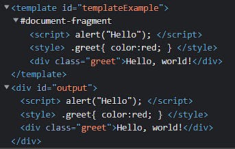
we can write Templates using <template> tag, where the content can be any syntactically correct HTML. We can also put styles and scripts into <template>. The browser considers template content as out of document, due to which styles, scripts or any other content is not run until we attach template to some element of DOM.
The content of the template is available as a DocumentFragment in its content property. This is a special type of DOM node that can be treated like any other DOM node, except for one special property: when it is inserted somewhere, its children are inserted instead. For example consider the following code :
<template id="templateExample">
  <script>
    alert("Hello");
  </script>
  <style>
    .greet {
      color: red;
    }
  </style>
  <div class="greet">Hello, world!</div>
</template>
<div id="output"></div>

<script>
   // Clone the template content to reuse it multiple times
   output.append(templateExample.content.cloneNode(true));
   // Now the script and styles from <template> runs
</script>
Output looks like :


Slots
Slots are like placeholder elements in a template that can be filled with different content. This flexibility gives you a lot of control over how your template is rendered. For example, you can use slots to create different versions of a template for different screen sizes. Or you can use them to change the order in which template elements are rendered.
There are two types of slots: named slots and unnamed slots.
- Named slots are used to specify a particular slot that you want to fill with content.
<slot name="X">...</slot>– gets children with slot="X". - Unnamed slots, on the other hand, are used when you don't need to specifically target a particular slot ( or you want all the remaining content to take this spot )
Slots are better used when combined with remaining Web Components, so let's combine all the above concepts (custom elements, shadow DOM, templates) and write a simple usage of slot
<template id="greetTemplate">
  <style>
  .greet{
    color:red;
  }
  </style>
  <div class="greet">Hello, <slot name="user-name">World!</slot></div> <!-- #(1)  -->
  <div>
    Remaining Content : <slot></slot> <!-- #(2)  -->
  </div>
</template>

<greet-element>
  <span slot="user-name">Veeresh</span>
  Some Remaining Content,<b> More content </b>
</greet-element>
class Greeting extends HTMLElement {
  constructor() { super(); }
  connectedCallback() {
    const shadow = this.attachShadow({mode: 'open'});
    const template = document
        .getElementById('greetTemplate')
        .content;
    shadow.append(template.cloneNode(true));
 }
}

customElements.define('greet-element', Greeting);
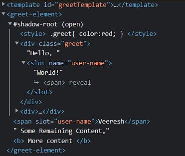
You can see 2 types of slots being used here ( refer to #1, #2 comments in HTML code). The first slot takes user-name, if you dont get user-name from custom element, it uses world! as default text. The second slot is the default slot ( i.e without a name ), which consumes all the remaining children. If there exists multiple default slots, only the first one is considered and all subsequent unnamed slots are ignored.
Output :


From the above output you can see that the slots are still at same position and haven't moved to shadow DOM, but still it renders on the browser DOM. This process of rendering slotted elements inside their slots is called “composition”. The result is called a “flattened DOM”.
HTML Imports :
You know importing JS modules or CSS files right? How about importing HTML files? There comes HTML Imports. HTML Imports is a feature of the Web Components specification that allows you to include HTML documents inside other HTML documents.
This is useful for creating reusable components that can be used across your website or web application. For example, you could create a component that contains a navigation menu, and then use the HTML Import to include that component on every page of your website.
HTML Imports are also useful for loading external resources, such as CSS stylesheets or JavaScript libraries, that are required by your web components.
Including an HTML Import is similar to using the <link> element to load a CSS stylesheet, or the <script> element to load a JavaScript file.
To include an HTML Import, you use the <link> element with a rel attribute value of "import":
<link rel="import" href="/path/to/import.html">
The href attribute value is the URL of the HTML document that you want to import.
Once an HTML Import is included in a document, the browser will fetch the imported document and process it.
If the imported document contains any <link> or <script> elements, those resources will also be loaded and processed.
When the imported document is processed, any elements will be processed and the contents will be added to the main document. Any <script> elements will be executed.
After the HTML Import is processed, the resulting document will be updated to reflect any changes that were made.
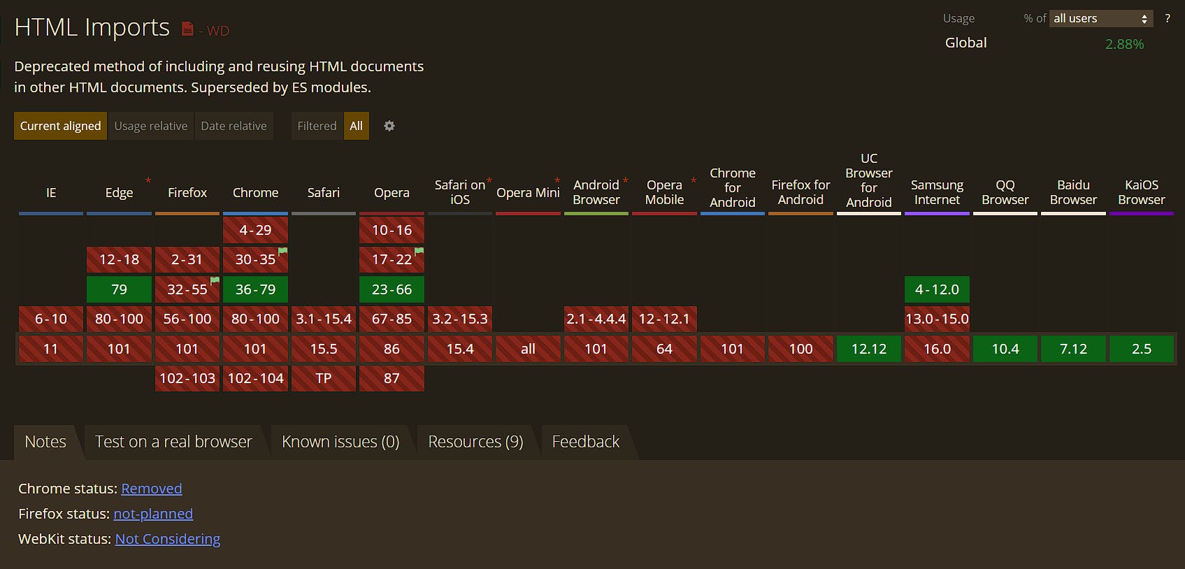
HTML Imports are a powerful way to create reusable components and load external resources. Though they are deprecated, you can still use them by including a polyfill for it.
Deprecation of HTML Imports

HTML Imports was really an exciting feature and it makes the web development truly modular. But most of the browsers rejected it. The common reason is HTML Imports were redundant, as you still need JavaScript to make the stuff run.
But there exists a successor to this deprecated HTML Imports, that is HTML Modules. HTML Modules are the new proposal for importing HTML files into a document. To know more about the proposal please have a loot at this HTML Modules Explainer
Conclusion :
I hope you got to know the basics of Web Components and various concepts like Custom Elements, Shadow DOMs, Templates, Slots, HTML Imports, HTML Modules, etc. This is just a tip on top of an iceberg. To know more about the concepts please find the below references on each topic.
Custom Elements, Shadow DOM, Templates and Slots, HTML Modules Explainer .
Also, check out the support of Web Components by different browsers here at Can I Use Web Components.
There also exist a few libraries that make developing web components easier, a few of the leading and my favorite libraries are Lit and Stencil.
You are awesome, you came this long. If you do like this post please let me know.

